Tuesday, 29 December 2015

Research Rationale

I have chosen the genre of Hip-Hop for my music magazine, I will need to conduct research into this genre and collate data from my target audience. My target audience will be Hip-Hop lovers around the age 16-25, as most Hip-Hop is pre-dominantly targeted at young adults and teenagers. This is an advantage for me as some of my peers in sixth form belong to this age group and listen to hip-hop which makes it easier for me to collect data as it is less time consuming. The benefit of conducting a research is that it broadens your understanding of what the audience demands/requires which you can implement into your magazine. I will gain different types of data through various methods such as focus groups where a particular convention of the magazine will be discussed, another example is a questionnaire where I will be asking open questions as they generate more of an accurate outcome as the interviewee is free to answer in any way they desire which does not limit the amount of information retained, compared to closed questions which prompts the interviewee to answer in a certain way which creates a biased outcome/findings. These findings generate qualitative data.

On the other hand I can also gain quantitative data by giving the target audiences questionnaires which would contain multiple choice answers which will be taken into account to generate quantitative data. I will also use the internet to gain a better understanding on how artists are portrayed in this music genre in order to conform or to subvert from the stereotypes in terms of how induvial artists are portrayed in a hip hop magazine.

Friday, 25 December 2015

This is a mood board I have created in order to analyse and compare various forms of typography.

Wednesday, 23 December 2015

Tuesday, 3 November 2015

PRELIM TASK

I used the same model that was on the front cover as one of my pictures for the contents page as this will automatically create a link between the contents page and the front cover which results in a higher cohesiveness of the two pages. The readers will be more aware of the fact that these pages are from one magazine due to the links and the cohesiveness for the front cover and the contents page. I also used the same colours that were on the front cover for my contents page as this will make the magazine look less odd. As if other colours were used it may hint some form of sloppiness of the magazine as other colours suggest the magazine may be going off-topic from the information provided by the front cover. I also used the masthead on the contents page as this improves the cohesion of the both pages as the same content appears from the front cover appears on the contents page. However, too many similarities may bore the readers due to the same conventions appearing again and again hence, the use of different fonts for the headings and numbers.

PRELIM TASK:Contents Page Layout

I gathered various information from magazines to come up with a suitable contents page for my target audience. I used my flat plan to structure the contents page in terms of the texts and images. I used Photoshop to construct this magazine. I started by adding texts to the contents page and the main images, to formulate a rough idea of where to add other pictures ensuring that there are no blanks to make the contents page eye-catching and not dull.
 I experimented with various colours to see what colours would go well with the pictures. I used brown as it is a dark and a vibrant colour which would make it easier to read the text over the image in the background. Also the contents is a different font and colour to that of the front cover as this creates inconsistency within the magazine so the reader feels that its not the same content throughout the magazine, it can also be more appealing as the reader is not viewing the same colours every time.


However, the range of colours used would make the magazine less sophisticated and less appealing as there are two different non-complementary colours which were used.I dealt with the issue by changing the font but, using colours that were used on the front cover as this gets rid of some inconsistency of the colours and fonts which makes the contents page look more sophisticated and creates a link to the front cover. Through the use of Photoshop i decided to add shadow to this text this would make it more eye-catching but not too much as it wouldn’t get too much attention, which is beneficial as the readers are made to focus on the other text 
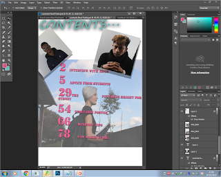


Moreover, the new colour didn’t go well with the other text which had a relatively different font to the font used for ‘contents’ so I used a complementary colour to the colour used for the heading this was suggested by the colour wheel i made sure that this colour was bright and eye-catching and it suited the image of the model well. The colour i used was a bright pink which would be suitable for the contents page and the image, as the image depicts a picture of a girl, hence the use of pink as it conveys connotations of a female girl. I researched on complementary colours where i found the colour wheen which depicts what shades go well with other, i used it to decide what colours to use.
Also the opacity of the image was reduced to make the image blend in with the background colour white, this was done so the image didn’t stand out on the contents page therefore it looked as if it was part of the magazine. I also adjusted the brightness and contrast of the image by using levels which gave made the image more clear only to an extent where it didn’t stick out too much.


I added images after to the contents page to fill in the blank spaces of the contents page, these images linked to the headlines of the article which was shown by the use of numbers which corresponded to the numbers next to that particular article headline related to the image. I also ensured that too many images weren’t added to the page as this would have made the contents page overcrowded, hence I filled out the blank on the bottom left by adding the masthead of the front cover to the contents page which would make the magazine more cohesive.
I experimented with various effects on Photoshop to make the image blend in and look appealing this was done by dropping shadow which made the image look more appealing as well as sophisticated, due to the shadow having a light black colour. The images were placed diagonally placed as this made more space between the two images at the top to prevent overcrowding and to make it more eye-catching. I also did it with the image at the bottom so all the images had the same effect as they all have the same purpose which is to hint the reader about the headline. Lastly, i decided to place the two images with the same background next to each other as they are similar. 


Sunday, 1 November 2015

PRELIM TASK:masthead


My masthead is called key to success as my magazine is about guidance for the new sixth formers, therefore I thought it would be suitable for my magazine to be called key to success as the magazine acts as a ‘key’ to success. Also the name sounds sophisticated and mysterious therefore it will encourage people to buy this magazine as they may want to find out more about this mysterious ‘key’.


 I chose this font as it is looks sophisticated, clear and vibrant which are all key elements for a good masthead to attract my target audience.


This font on the other hand looked scary rather than attractive it’s also not suitable for a college magazine as this theme carries connotations that of horror which was is not my theme for this magazine.
I like this font as I feel it is sophisticated but not too much which would be ideal for the school magazine, however It would draw too much attention to the masthead rather than the other conventions on this magazine. Also some of the letters such as the ‘y’ are hard to identify which would make it unclear also there is too much space between each letter which would make it hard to fit the masthead on the magazine.