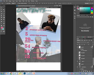
I gathered various information from magazines to come up
with a suitable contents page for my target audience. I used my flat plan to
structure the contents page in terms of the texts and images. I used Photoshop
to construct this magazine. I started by adding texts to the contents page and
the main images, to formulate a rough idea of where to add other pictures
ensuring that there are no blanks to make the contents page eye-catching and
not dull.
I
experimented with various colours to see what colours would go well with the
pictures. I used brown as it is a dark and a vibrant colour which would make it
easier to read the text over the image in the background. Also the contents is
a different font and colour to that of the front cover as this creates
inconsistency within the magazine so the reader feels that its not the same content
throughout the magazine, it can also be more appealing as the reader is not viewing
the same colours every time.However, the range of colours used would make the magazine less sophisticated and less appealing as there are two different non-complementary colours which were used.I dealt with the issue by changing the font but, using colours that were used on the front cover as this gets rid of some inconsistency of the colours and fonts which makes the contents page look more sophisticated and creates a link to the front cover. Through the use of Photoshop i decided to add shadow to this text this would make it more eye-catching but not too much as it wouldn’t get too much attention, which is beneficial as the readers are made to focus on the other text

 Moreover, the new colour didn’t go well with the other text
which had a relatively different font to the font used for ‘contents’ so I used
a complementary colour to the colour used for the heading this was suggested
by the colour wheel i made sure that this colour was bright and eye-catching
and it suited the image of the model well. The colour i used was a bright pink
which would be suitable for the contents page and the image, as the image
depicts a picture of a girl, hence the use of pink as it conveys connotations
of a female girl. I researched on complementary colours where i found the colour wheen which depicts what shades go well with other, i used it to decide what colours to use.
Also the opacity of the image was reduced to make the image
blend in with the background colour white, this was done so the image didn’t stand
out on the contents page therefore it looked as if it was part of the magazine.
I also adjusted the brightness and contrast of the image by using levels which
gave made the image more clear only to an extent where it didn’t stick out too
much.
I added images after to the contents page to fill in the
blank spaces of the contents page, these images linked to the headlines of the
article which was shown by the use of numbers which corresponded to the numbers
next to that particular article headline related to the image. I also ensured that too many images weren’t
added to the page as this would have made the contents page overcrowded, hence I
filled out the blank on the bottom left by adding the masthead of the front
cover to the contents page which would make the magazine more cohesive.
I experimented with various effects on Photoshop to make the
image blend in and look appealing this was done by dropping shadow which made
the image look more appealing as well as sophisticated, due to the shadow
having a light black colour. The images were placed diagonally placed as this made more
space between the two images at the top to prevent overcrowding and to make it
more eye-catching. I also did it with the image at the bottom so all the images
had the same effect as they all have the same purpose which is to hint the
reader about the headline. Lastly, i decided to place the two images with the same
background next to each other as they are similar.


No comments:
Post a Comment